A graphic designer, you live in a pretty apartment that you keep neat and clean. You love simple and straight lines, with just a touch of femininity. Pink? Of course! As long as it paired with black, grey, or brown. You drink your soy latte by the computer while clicking away on your mac with browser tabs open to Pinterest, Instagram and all of Adobe Suite.
You're getting your Masters in Philosophy, tending to write your papers from the comfort of your bed. To you, design is just another way to make your nest a cozier place. After all, you love snuggling. You prefer hot chocolate, even more when you add a marshmallow. You love your laptop, but also the sound and smell of pencils on paper.
A writer specializing in historical novels and avid collector, while traveling to European capitals to visit archives searching for new materials, you'll always look out for little antique shops on the small streets. You drink your Espresso with a small glass of Soda, while in front of you four large crumbling books lay open, two of which were given to you by a questionable British acquaintance.
A busy lawyer, your home is the one place you can relax. Your crazy and stressful schedule makes you look for blissful harmony between your four walls. You drink your tea with your eyes closed, taking time to breathe and listen to the voices from the quiet street below your house between sips. A bird chirps, rain drizzles on the roof, wind blows, a child laughs, a car drives by. Silence.
Tip No 1: Pick a well lit room, black walls need balance. photo from here
Wall colors.
Now when it comes to choosing colors for your wall, I feel like there are two main roads people take. White, and cream. Every once in a while some magazine will come out with hot trends for wall paint, and people will oooooooh and aaaaaah, and think about painting one wall in a different color. Then they go to the paint store and buy not cream, not white but - wait for it - Beige!
Adventures, right?
Tip No 2: Use natural textures (like wood) to create a softer feel via here
Hey I'm not judging! I'm a black and white type myself. And not b/c I don't like colors! But rather b/c I love them. A black-white-grey setup is perfect for color lovers, b/c it gives a wonderful backdrop for changing up accessories with different colors without having to start over each time.
My entire house was painted white - other then my children's room which is painted in a grey-green color (I'll post them in a different blog post).
What changed all that? A story in the old version of Domino about J Crews creative director Jenna Lyons. (Interestingly enough, Jordan Ferney's bed room in the first photo was also inspired by this same story:) As I read it everything I once thought about wall color choices changed.
Tip No 3: Use lot's of white to light up the space even more, it's all about balance! Found via here
The next day I was at the paint store. Not yet ready to buy black paint, I bought a dark shade of purple. The women at the counter asked me if I was a photographer in need of a black room:)
We painted our bedroom purple, and I can tell you the women from the store was wrong. With the white bedding and our big window - the room is very bright and airy.
And if we are breaking myths, how about painting a children's room black?
Tip No 4: use bright colors like orange and yellow that will really pop against the black wall
I'm not quite sold on a black wall in a child's room, but you'll have to agree with me that this nursery is simply beautiful. It is also taken from Jenna Lyon's home. In the story they did she said she and her husband tried to imagine there son in his first year, lying on his back in the crib. That is what inspired them to pains stripes on the ceiling - what a lovely idea.
All of the tips in one image: well lit, lot's of white, natural wood texture, pop of color (the blue cup) via here
We are building our new home as I write this post, and I know a black wall will definitely be there.
How about you? Would you consider painting a wall black? Let me know in the comments:))
I love Design Magazines. Flipping through the pages, daydreaming, pretending I'm in those beautiful photos on the 54th floor looking over an amazing urban view surrounded by pretty things.... A girl can dream, right?
I don't need any excuses to look through my piles and pile of magazines (which I keep in seperate color coded binders, naturally). After all, it is professional literature (Mommy's working, honey).
But if you really want to learn something from magazines, it's not enough to just flip through them ooohing and aaaahing as you go along. Like I wrote in an earlier post about using inspiration - if you don't ask yourself - what is it about this photo that's working- if you don't translate it into actions - you will have a hard time replicating what you loved, and will probably just end up copying and pasting instead. A more critical approach will reveal the true secrets of the trade that you can use to create different moods in your home.
And b/c last week I spoke about balance, here are three tricks I learned from studying magazines - all about creating balance in your home. Specifically, your coffee table.
Balancing shapes. Are you using a stack of rectangular magazines? Place a nice round bowl on top of them, or place them on a round table. Too many angular shapes (square sofa, rectangular picture frames, square coffee table...) will give a harsh pointy feeling to a room. Counteracting these shapes with some round ones will give a more cozy and soft feeling. The more round shapes you use, the cozier the room will feel - like in the picture above.
Try It: Look around the room -are you balancing both shapes in the room? Well, are you?
You've seen it in every magazine, style blog, Pinterest board and Home makeover show - what's up with that?!
To understand the use of the tray, let's take a look at art. Many painting start with a canvas. The artist will decide on the composition based on the canvas. And the composition is one of the most important part of the painting. It will decide the mood of the piece - peaceful or tense? Happy or sad? Busy or quiet? It will lead our eye across the painting. It will set the tone of our reaction to the art piece.
Trays are the same.
When we place things in a tray (with purpose, not just chuck them in:) it's like three dimensional art. This will help us lead someones eyes throughout the room, set the mood - you get the picture. Curate these trays with purpose.
How?
Mix useful objects with little nicknacks that make you smile. It doesn't have to be something expensive, just a little private joke with yourself. And remember to keep your colour scheme in mind.
Try It: fill a tray with 5 objects in different sizes. Play around with the composition until you're pleased.
A little bit of bling goes a long way, weather it's something you picked up at the flea market for a couple of bucks, or a fancy heirloom that's been in the family for centuries - us humans have a long lasting relationship with anything shiny. Going for a dramatic look? Mix metals with black or grey. Want something a bit softer? Go for pinks and pastels. Don't let your stigmas about gold in home decor get the best of you, give it a try!
And now it's your turn. What great home styling tips do you swear by?
I'm finally back after a couple of weeks vacation, I hope you all are doing well:)
I told you all in previous post about the Jewish New Year we celebrated a short while back. I actually made some resolutions for the new year:
1. Go to sleep three times a week before midnight
2. Start working out (I wish I could say get back to working out, but that would be a lie:)
3. Eat three meals a day
Yes, this year it's all about balance.
I wonder how long it took to style this photo? From the Crate and Barrel website
Balance is a tricky thing.
It's not about letting go of clutter, but rather about spreading it out wisely. Knowing how much white space to leave, how much to push elements close together, the proportions, the relationships between the two, if you can get it just right, you experience a truly balanced moment, quiet and simple.
I would buy everything here. Photo by Lisa Cohen for Country Road Homewares via The Design Files
Take interior decorating, for example. When I go into a room that has the a light and airy feeling, where everything is in it's place, and there isn't that cluttered feeling - I feel a sense of calmness that helps me think straight. That's why I don't own to much stuff. Everything I own is chosen carefully, and what I don't use I get rid of.
Lovely styling, from Jenni Juurinen. The key is balance.
And just like in these lovely photos, balance normally does not come naturally. It is something that is achieved with planning, trial and error, and a lot of heart. You don't always know how to get to that special point, but once you're there - you'll know it.
You may want to learn how to make yogurt from Kinfolk , I just loved the styling
So yes, I will probably continue to be the compulsive planner that i am, but this time I'm reminding myself to plan a bit of peace and quiet into the regular crazy mix.
And to finnish off this post, I'll leave you with one of my favourite photos from the Photoshoot I had with Efrat Lozanov. This photograph has that special peaceful quality, but with a bit of sparkle.
Lately I've been moving stuff around. Again. I get tired pretty easily with the way our Caravan looks, and I'm always looking for ways to change it up. My husband asked me a couple of years ago when I'll be finished decorating our house. I thought that was the funniest thing ever.
The good thing about constantly redecorating, is that it gives me loads of new ideas for the studio. Every time I feel like I'm missing something around the house, I start thinking about how I'll design it myself.
The way I look at design is fairly simple. I always keep the backbones neutral, then play it a bit less safe on the accessories. This works for every form of design - interior, product design, fashion design - even for setting-the-table design.
For example, the pieces I know I won't be changing very often - the sofa, a rug, shelving - are all in neutral tones i.e. gray, white, and more gray. Then with the pillows, storage units, pictures, that's where I'll get creative. What's amazing is that these accessories are what gives the room it's personality. (Silver sequin pillow, anyone?)
The same thing goes for table settings. My dish set is white, and so are most of my serving pieces. But I will have some serving pieces in less conservative colors, and mix it up with a printed tablecloth, or some cute trivets. You'd be amazed how changing up the accents help shift the entire mood.
But if you think about it, it's sort of like wearing jeans and a white T. With shoes, jewelery, and hairstyle - you can play it up or down - the accessories set the tone for the entire look.
So I found myself looking to spruce up our walls a little, and seeing as we might not be living here that much longer, painting seemed overdoing it. I decided to change some of the artwork. I knew I'd be using some of my own sketches, a print by my amazingly talented friend Keren Asaf, and a couple of prints I was planning on designing on my own. Of course that turned into a mini collection of prints, now available on my Etsy shop, and soon up on my site.
What can you expect to find there? Geometric patterns with a 3D effect, crisp ornament-like patterns, and a little bit of love, all in the subtle and clean style I use with all of my designs. Color wise, I kept it in shades of black/gray/white, and some pops of fuchsia, teal, and blue, with the occasional pastel shade - simple and modern. I love the way they are lively and calm at the same time.
Right now they come in A4 size (that's 8.375" x 11.750"), but soon they'll be up in US standard letter paper size as well, and larger prints or postcards will be available, too. The paper is slightly textured, that adds some depth.
Sometimes people ask me - where do your ideas come from?
I don't have one answer to this question. A lot of things can spark an idea for a new product - a problem that needs solving, an interesting material I'd like to work with, the internet, of course - each time something different.
I can say that what most of my designs have in common is the large effort I put into each one. A lot of people think of the creative process like a light switching on, an Aha! moment, what many of us call "inspiration" - but for me that is not the case.
I sketch, erase, surf the web, sketch again, fall in love with my sketch, go to sleep and wake up hating my sketch, erase, and start over... In Hebrew we say "inspiration rested on me" - that always makes me laugh - if inspiration is resting why am I so tired...
Sometimes there is a breakthrough, but normally I feel in my heart what the design needs to be, and it takes a while for my hands to get there. If you follow my on Facebook, you see the pictures I sometimes share from the design process. The final result can be miles away from where I first started.
Sometimes I worry I will never get it done in time, that it will never be "just right". But with the hard work, things start falling into place, and my intention is met with the final result. That for me is the biggest satisfaction.
I have only recently started to blog in English, and although I am fluent (my father is American) this is completely our of my comfort zone. Going through my posts in Hebrew and translating them has been quite challenging, and I really appreciate you reading and I do not take it for granted.
So last week I told you I'd be giving you a gift - and I am keeping that promise. If you sign up to get updates - you will receive first notice about special sales, coupons, tips and trick for design as well as a set of downloadable postcards with the graphics I designed for the Coasters and Butterboards at my shop. It took a long time to get them to be just right, and I am pleased with how they came out:)
You can hang them on the wall (like in this last post), send them to a friend, use as a card on a gift - anything really. Here's what you need to do - Sign up at the bottom of this post or to the right. once you finish the Sign Up process (you'll need to confirm the email you'll get after signing up), you will receive a link to download the Postcards. And if you have any trouble, write me at - elisheva@hooknloopdesign.com. I will send them via mail.
I'd love to see how you use them! Send me a photo or upload them on the studios Facebook Page.
I love design magazines. I can't bring myself to cut pictures out. I can't throw them away. I take care of them as if they were rare books, carefully bookmarking pages and photos for future reference.
Lately I've been wanting to expand my wall "art gallery", and have been marking a lot of great photos for inspiration.
Something about hanging a number of pictures on the wall seems so effortless, free and fluid. It looks easy, adds a special touch - and is interchangeable - all of the things I love about design.
These types of galleries rarely look planned, but often are. I'd like to share some tips with you that will help you achieve a casual unplanned look. So take a couple of minutes to read this guide - before you start hammering your wall.
I'm an industrial Designer. This is my trade. I took me four years in Bezalel Academy (a big art school here in Israel) to get my diploma. A lot of you already know this. But what you don't know is how long it took me to accept this was what I do, and even love it, and that that's OK.
Every year at Design School, as the semester would come to an end, I'd apply to the University to study Psychology. Every year for four years. I kept saying to myself (I talk to myself a lot) - Elisheva - how is it possible that all of your friends are studying such important subjects that actually help society ( Education, Medicine, Social Work, Physiotherapy - I have a pretty cool group of friends) while you sit on your chair in the studio at school, at 2 am, playing around.
"folding chair" - 3rd year studio project, Bezalel
I went to school with some amazing people (a ray of light in what was otherwise some dark 4 years), and we'd often find ourselves upset, tired, stressed out, and running late. And all of this, for what? It's not like we were saving lives or anything. We're not changing the world. So why are we working this hard? Why are we taking school this seriously?
"Felt and String" Soft Materials, 3rd year project, Bezalel
The great people who went to school with me shared a common trait - dedication. They were all so dedicated to doing there best - and they'd spend time, money, energy - anything really, for an amazing project. No one just slid through it. And trying so hard and putting so much effort into school while not really being sure if it's actually important or means anything - was the hardest part for me.
So how did I end up finishing school? What helped change my mind?
"Countertop", 2nd year studio project, Bezalel
My Mother.
My Mother is a women with exceptional taste. Growing up our house never looked like my friends houses. It was always so pleasant to be in, every object was personal and carefully chosen. Whatever she couldn't buy - she made.
So on one of the occasions where I applied (yet again) to the Psychology department - I told her how horrible I felt when I compared myself to my friends. It's hard for me to deal with nonsense in such a serious matter, I told her. All of my friends are doing something far more important.
And that's when my mother told me something that changed everything.
She said she wouldn't want to live in a world without beauty. Such a simple sentence that allowed me to finally embrace what I had been doing all this time.
For me, beauty isn't just about aesthetics. It's when the objects around us allow and help us to live the life we always dreamed we'd have.
In my eyes, a beautiful home is one that makes me smile as I walk in, that hints to me who lives in this house, and that get's me excited about what is yet to come.
Do you know the feeling when you're invited to an event, and you really don't want to go? But then you find a perfect dress, and all of the sudden you're really excited and happy about going?
That's what I want to create as a designer. That anticipation for having people over at your house, the Beautiful surroundings that make us want to create memories in.
And the more I understand that's what I want to do, the better I am able to express myself clearly as a designer, and really understand my pont of view. Designing pretty items, modern and subtle, that hold a smile and a promise, that you can move and build and change.
So Lately we've had some Holiday time in Israel, and I found myself looking for things to do with the kiddies. We spent a lot of time coloring and doodling - although my daughter is only two, she seems to have found her calling. She fills page after page using her crayons, and they keep piling up. But it's nothing compared to the amount of pictures my son brings home from Kindergarten.
If you have children - you know what I'm talking about. I often find myself buried under yet another pile of "art" - wondering what would be the motherly thing to do. I'd love to help my budding Picasso's, but how do I do that without having my house look like a Kindergarten? A lovely reader asked me just that (thanks, Michal) so here are a couple of ideas for displaying kids artwork - while still maintaining an esthetically pleasing home.
Every parent has there own point of view. Some have folders and binders filled with there children's laminated artwork, others chuck it all out while their kids are sleeping - I'd like to suggest a middle ground:) Go over the Art with your child - decide together what you're keeping and what you can throw away. Once you have chosen, here are a couple of ideas - and why they work.
1. Artwork Poster:
This photo is taken from the house of Designer Jan Elen - she takes pictures of her kids drawings and sets them up on a poster sized file in a neat grid, then has the poster printed and framed. The expressive artwork organized so severely gives this poster a modern feel, meaning it could easily be hung in the living room. (And a digital catalog also take up a lot less space)
2. A photo wall:
Get a wallpaper like effect by hanging the pictures in simple identical frames (these were purchased ad Ikea). Choose a bold color and many frames.
Why? Because it makes all of the eclectic pictures seem more like a collection, which make the wall look modern and not cluttered. And what boy or girl would not get super excited to see a wall like this made from there own masterpieces? Every once in a while you can refresh the display with their more current work.
Use a couple of clipboards to make an ever changing display of kids art. You can hang one picture every time, or a couple. I would recommend using at least 4 clipboards. Why 4, you ask? Think of just one clipboard on the wall.
Hmmm, nothing special.
But a couple of them - well that makes a clear statement. When working with something so colorful and eclectic (in our case, children's drawings) you need to find a way to let your eye rest and take it all in. Keeping a neat grid with even distances between the boards will do just that. You can also set aside a clipboard or two for each family member.
The idea for these handmade cards came from one of my older designs - wooden wall decor for kids (you can still purchase them here), and it works best with the more, ummm, abstract children's drawings (my personal favorite - we call them dancing colors).
So how do you make them?
Fold a piece of cardstock in half. Draw the image you'll be cutting out with a pencil (you can also trace something you've printed). It could be anything - a simple heart shape, an animal, you get it. Use an exacto knife to cut the image out. (You could also use a fancy whole punch. Just remember the bigger the shape is the more artwork will be seen).
Open the card and and glue your kids art inside (you may have to cut off the edges depending on the size). When the card is closed the cut out image fills with the colorful details of your child's art, and when it opens you have a small surprise.
My kids really loved this. I think it made them feel included and useful - and super proud.
I hope I sparked some new ideas for displaying kids art. And truthfully, you could use these ideas for displaying lots of other forms of art - postcards, doodles, pretty papers - you get the picture.
So what do YOU do with your children's artwork? Share your ideas in the comments!
I have been waiting for so long to show you the new collection, and I finally can!
A little intro - this collection really represents my point ove view as a Product Designer, and my thoughts about design in general.
I love objects that you can interact with. Building, moving, taking a part. An abject you can't interact with is more like a statue, and I'm not a sculpture:) I want to design objects that change from house to house, that look different over time. And of course - for them to have that simple and chic effortless style.
So this was my inspiration board for Spring-Summer 2013 you may have seen on my Facebook Page. I think you can get a good sense of the vibe for this collection, don't you?
And you know Gisele had to be there....
So the design I want to share is the Candlestick Stacks. You may remember I showed you a little preview here, and this is the final result. You receive three individual candlesticks that can be stacked into different designs, or used separately. One side fits a candle, and the other is the perfect size for tea lights. They come in white, black, and bronze.
In Judaism, it is customary to light two candles every Friday evening, at sundown. This marks the beginning of the Sabbath - our day of rest. This is normally done by the women of the house. In my family, you light an additional candle for every child that is born. I received a pair of lovely pewter candlesticks when I got married. When we had our eldest, I found a cute little pewter candlestick in a second hand store. The problem was, when my daughter was born I couldn't find a matching candlestick. So for the past two years I have been lighting a simple candle for her, when everyone else has a fancy pewter one - needless to say I fell horrible. So i kept thinking - wouldn't it be cool if my candlesticks could have "children" of there own. Thus - the Candlestick Stack was born.
The next design is for foldable bins made from industrial felt. This material is normally used as carpeting - making it very durable. Using some simple slits and flaps, you can easily set up your own storage bin - in small or large.
The next design is a house shaped napkin ring! It has many brothers and sisters you will get to meet in the next collections, I promise. Somehow, it is super cute and modern at the same time - something which is very hard to achieve. As the design came along, it became pretty obvious that such a special napking ring needs extra special napkins - that's how I came to design the linen napkin set. The linen I chose is soft but has a bit of a rough texture - giving it depth. The color combinations keep it on trend, turning even the most simple table setting into a head turner.
The coasters and butter boards were, for me, what tied the entire collection together. The geometric patterns along with the more organic shapes are what interests me esthetically.
The butter-boards are extra big, and can be used as little trays for cookies and a cup of tea, or for cheese, and even as wall art.
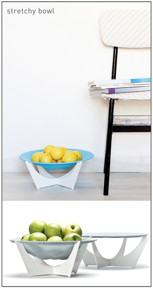
And the last item, continuing with me from my previous collection - the Stretchy Bowl. For those of you who aren't familiar with the bowl - it is made of a collapsible metal base and stretchy fabric netting. So when you add fruit - the bowl expands (think - a fruit trampoline). The netting lets air in, keeping your fruit fresh longer. And the wonderful thing about this bowl is that although it can be big, it literally takes up no space when you're not using it - b/c it packs flat. It's been featured in Gizomodo, and Treehugger and continues to be a big success. This design is clever without trying to hard - just the way I like it.
Seeing all of my ideas come out of production as tangible products was a huge deal for me. And the photo shoot with Efrat Lazanov (you can read more about that here) was pretty cool too.
As for the new collection - all of the designs can be purchased at my shop. If you'd like to purchase anything from my previous collections, I keep some things on my Etsy shop.
A new collection is a big milestone, and I always fear what people will say or think. So I'd like to thank all of you who are on my Facebook Page, for all of your likes and comments - I'm so happy I get to share all of this with you:)
I had so much planned for this week - and then we had a crazy storm. Everyone kept telling me to cuddle up with a hot cup of Cocoa and lay low in my house for a while. But looking around my house all I could think of was how much I wanted to change. I turned to Pinterest for some inspiration - and was blown away by the amount of crazy beautiful images I found.
From the right clockwise: 1. image from here 2. image from here 3. image from here 4. image from here
Drowning in a sea of inspiration, I felt lost.... So many amazing interiors, so many styling ideas, so many Scandinavian women with impeccable taste (is it in their water or something?!) So what can one do to make sure all of this inspiration doesn't get lost on ones Pinterest account? That you're acutually inspired to DO something, not just pretend to?
In this post, I will share what I do with all of my "inspiration" to make sure I actually use it. This is my guide to finish a night of blog loving feeling - "Let's do this!" and not, let's just move to Holland.... They seem to know their sh*t.
So here's how this goes. You found an image you love. After you've finished swooning, you have to ask - why does this work?
For example, the image above - why does it work?
Even though the colors are contrasting, there is a soft and comforting feeling. And although there aren't a lot of colors being used, there is a feeling of depth.
Conclusion: Using a lot of textures helps to create depth. And grey is such a beautiful color.
The use of neon in the details, on a warm and neutral backdrop is anything but overbearing. And this is what we would translate into a living room design, for example. Think - a subtle grey colored sofa, wooden chairs, grey and pastel colored pillows, and maybe some neon piping on a couple of the pillows.
Conclusion: If you're looking to infuse some neon tones into your decor (and you know you are) use a hint of them in the details, together with neutral tones. And here's another image from my new favorite blog:
To sum it all up, here are three "rules" to makeover a room using these photos as inspiration:
1. Pick a neutral color - grey/brown - for the room you're decorating - ie for the walls, sofa, rug etc. Make sure to use plenty of textures - smooth, soft, rough, matte, shiny....
2. Add some pastels for accent pieces - a chair, lamp, frames and pillows
3. Use a dab of neon on some piping on the pillows, handles, prints, etc.
Now for the fun part! Use these rules when you go shopping, this way you won't get overwhelmed when you go to the stores.... (I know, I've been there)
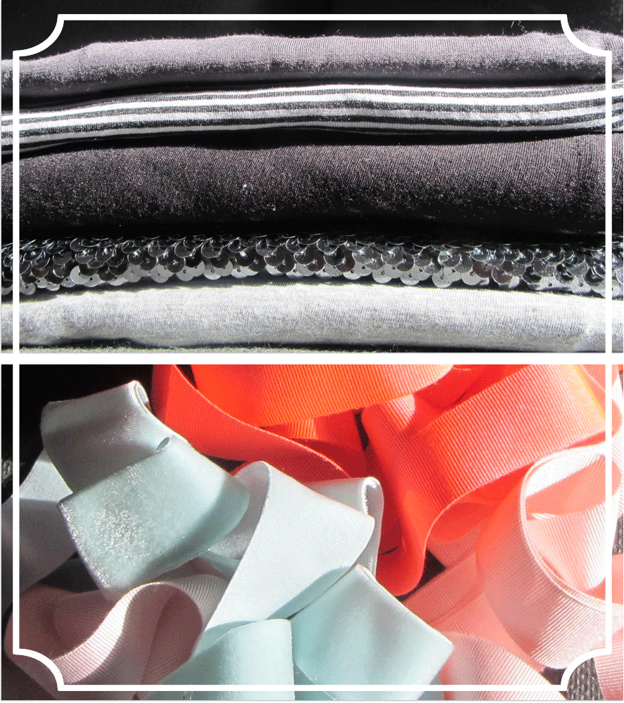
Here is what I got for my new pillowcases (for the sofa).